What is adaptive design and why is it used?
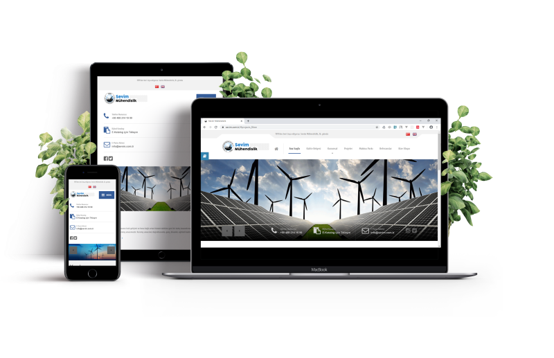
Adaptive design refers to a website that looks equally good on the screen of a small smartphone or tablet as well as on a PC or laptop monitor, regardless of their size, resolution, or operating system. In other words, adaptability is the ability of a website’s design and content to adjust to the size of the browser window and other characteristics.
Each year, the number of active internet users increases, and their preferences and behaviors change. In April 2014, the majority of users preferred desktop devices (70.6%), compared to smartphone users (23.6%) and tablet users (5.8%). However, by April 2024, the situation had drastically changed, with 60% of users favoring mobile devices, 37.8% favoring desktops, and 2.2% favoring tablets.
When creating an online store, corporate website, or landing page, it is essential not to ignore any category of users, as this could lead to the loss of potential clients. It is wise to develop an adaptive design that will encompass the entire audience.
What is adaptive website design?
Adaptive design is a specific type of resource layout that allows it to display correctly on various devices with different screen sizes and resolutions. With this type of layout, the server determines the type of device the visitor is using and selects the correct static layout for the screen size and resolution. This enables the site to load the necessary page elements for a specific device, ensuring fast loading times on mobile phones with proper technical optimization.
Adaptive layouts are created to fit the most common screen widths today (320, 480, 760, 960, 1200, 1600 pixels), allowing the resource to display adequately on a standard Android smartphone or an Apple iMac. This does not mean the owner has separate resources; adaptive design allows all content and information to be kept in one place and displayed to all visitors, providing full functionality.

However, there is another similar concept – responsive website design. This is slightly different from adaptive design and should be distinguished. Responsive design involves flexible web resource pages that use CSS media queries and size markers to adjust the scale of images, text, and their layout or scaling. In this type of layout, the page “responds” and changes according to the specific screen size.
Why is website adaptability necessary?
Today, adaptive website design is not a luxury or an additional feature but a necessity and a mandatory condition for promoting a resource on the internet. Besides the fact that over 60% of internet access is from mobile devices, Google has announced the dominance of mobile-first. According to this principle, the search engine primarily evaluates the presence, quality, and convenience of a version adapted for mobile devices.
The necessity of developing adaptive websites can be argued as follows:
- Convenience. An adaptive resource allows users to surf its pages from any device while maintaining the structure and design. It loads faster on mobiles and correctly displays graphic and text information.
- Cost-effectiveness. Creating an adaptive website is cheaper than developing two different versions – a primary one and a mobile one. It is also quicker and easier to maintain and support.
- Profitability. Since users can access the website from all devices, its traffic increases, thus boosting the company’s conversion rate and profitability.
- SEO promotion. By using the mobile-first principle, Google ranks adapted websites higher, even if they are identical to non-adapted ones in other respects. Additionally, all pages are under one URL, simplifying SEO promotion.
- Higher visitor loyalty. If buttons and content elements are displayed incorrectly, users are likely to leave the resource and switch to a competitor where all information is displayed correctly. Developing websites with adaptive design clearly demonstrates that the company cares about the comfort of its customers.
Methods of implementing website adaptability
Adaptability is integrated from the beginning of website development and design, so it is essential to determine the optimal type of adaptive design for a specific resource.
- Fluid grid layout This is a popular and straightforward method for creating an adaptive page layout. It involves “adjusting” the width of blocks to fit the screen size. Blocks that cannot be resized will be displayed sequentially at the bottom, one below the other.
- Creating layouts This is a complex, labor-intensive method aimed at various screen resolutions and monitors. The challenge lies in standardizing designs and creating layouts for the most popular resolution parameters. This method is relevant for corporate, business resources, and landing pages when it is essential to emphasize specific blocks to achieve the desired result.
- Block repositioning This popular method is used by resources with multi-column architecture. As the screen narrows, the blocks are simply moved to the bottom of the page.
- Text and image scaling This simple method is used for the most basic resources. It involves scaling only specific blocks and images, while other elements remain unchanged. This approach does not offer significant flexibility.
Advantages of adaptive website design
While the necessity of creating adaptive design is clear, here are the benefits for the website owner:
- broader audience reach – increases sales from mobile commerce by enabling comfortable shopping from all devices;
- ease of maintenance – the owner does not need to update information twice on two versions.
- consistent structure and design – adaptive websites maintain the same structure and design, benefiting users who periodically visit from desktops and smartphones;
- Higher conversion rate – indicates the website’s effectiveness from a marketing perspective;
- Easier promotion – adaptive resources rank better and occupy more favorable positions in search results compared to regular ones;
- Higher audience loyalty – caring for the client positively impacts site traffic and loyalty to the company;
- More affordable – developing, coding, and designing one adaptive website is cheaper than creating two versions.
Checking website adaptability
To ensure your resource displays correctly on all screens and monitors, you do not need to have dozens of different phones, tablets, and laptops or PCs with various displays (although this is also a good method). Adaptability can be checked using special services that simulate different screen sizes. This way, you can ensure that the layout looks equally good and is convenient and understandable on different devices. While these services differ in usability and some nuances, they essentially perform the same function. Some of these include:
- browserstack.com;
- designmodo.com;
- responsinator.com;
- responsivetesttool.com;
- responsivedesigntest.net;
- responsivedesignchecker.com;
- mattkersley.com/responsive.
Thus, adaptability is not a luxury but a necessity. Today, a company’s customer orientation is an indicator of business responsibility. Therefore, it is important to speak the “language” of the client, considering their preferences and interests. To retain visitors and potential clients, do everything possible to ensure their convenience, comfort, and sustained interest.